Brand
One spark, used sparingly
SuperGuide is about the moment a fact lights up and stays lit. That is the whole brand: a shield for the things worth keeping, a spark for the instant you get one right. The system around it is chunky and tactile, built from near-monochrome green with a single saturated accent that only appears when something is true right now. This page is the reference. Every colour, size and duration on it is read straight from our design tokens, so what you see here is what ships.
Logo
The shield and the spark
A shield for protection and guidance, a four-point spark for the thing you just understood. The mark is drawn as vector: an emerald gradient field, a dark teal keyline that holds it together on any ground, and the spark with its four small rays.

Clear space
Leave space equal to a quarter of the mark's height on every side. Nothing sits inside it: no type, no rule, no other logo. In the lockup, the gap between the shield and the wordmark is fixed. Do not close it.
Minimum size
The full mark holds down to 24px tall. Below that the four rays turn to mush, so use the simplified mark instead: the same shield and spark with the rays dropped, which is what the favicon uses. The horizontal lockup needs 120px of width.
Do
- Use the SVG. It stays sharp at every size and weighs about 2KB.
- Keep the shield's proportions. Scale it, never stretch it.
- Give it clear space: a quarter of the mark's height on every side.
- Set it on a plain ground: mist, void, or deep green.
Do not
- Recolour the shield, the keyline or the spark.
- Stretch, squash, rotate or round off the silhouette.
- Add a shadow, an outline, a bevel or a gradient of your own.
- Place it on a photograph, a pattern, or a colour that fights the emerald.
Colour
Mist, ink, deep green, one spark
Light is cool mist with near-black green ink. Dark is a green void, where the deep green lifts so it separates from the ground and the spark brightens. Gold and coral are functional only: gold for a streak, coral for a miss, never red. Every slot below is a CSS variable, --color-<name>. Click a swatch to copy its value.
Mist
lightThe default. Cool ground, hairline structure, deep green for actions.
Void
darkDeep lifts on buttons so it separates from the ground, and the spark brightens.
Both palettes define the same slots, so any component can be written once and rendered in either. The twoglow slots are rgba on purpose: they are light cast over whatever is underneath, not a fill.
Typography
Unbounded scores, Instrument Sans reads
Three faces, each with one job. Nothing else is used anywhere in the product.
Unbounded
display
Hero, title, heading, score and buttons. 700 and 800, usually uppercase. Wide and geometric: it makes a score look like a scoreboard.
Instrument Sans
text
Questions, body copy, answer options. A compact editorial grotesk that holds up at 22px on a phone.
IBM Plex Mono
mono
Labels, timers, counters and anything numeric that has to line up. Uppercase with 1px of tracking.
hero
40 / 44 · 800 · -1.2
Unbounded
Paste it. Play it. Keep it.
title
28 / 32 · 700 · -0.6
Unbounded
The French Revolution
heading
20 / 26 · 700 · -0.3
Unbounded
Due today
question
22 / 30 · 600 · 0
Instrument Sans
In which year did the Bastille fall to the Paris crowd?
body
17 / 24 · 400 · 0
Instrument Sans
Reading feels like learning, but being asked is learning. SuperGuide reads your paste, pulls out the testable facts and starts asking.
small
14 / 20 · 400 · 0
Instrument Sans
Zylo will nudge you before these fade. You can turn nudges off in Settings.
label
12 / 16 · 600 · +1
IBM Plex Mono
Question 03 / 15 · 00:42
button
15 / 22 · 700 · +0.2
Unbounded
Start the session
score
56 / 60 · 800 · -2
Unbounded
12
Sizes are in points on mobile and pixels on the web, and they are the same numbers. Every specimen above is rendered from the token, not typed in.
Motion
Three moves, nothing else
One move for arriving, one for a right answer, one for a wrong one. Hover a stage to replay it, or use the button.
Spring in
420msElements arrive from 20px below at 94% scale. It should feel like a shutter, not like jelly.
cubic-bezier(0.3, 1.4, 0.5, 1)
Glow pulse
900msA right answer inverts to ink and the spark ring blooms, then holds. Light moves; layout never does.
ease-out
Shake
380msFour hits, minus 8, plus 8, minus 5, plus 5, with a coral tint and no glow. Pairs with a light haptic.
ease-in-out
Under prefers-reduced-motion all three collapse to a single frame across the site and the app. Motion carries feedback here, never meaning: if every animation were removed, nothing on screen would become ambiguous.
Voice
Friendly, quick, a little cheeky
We are a guide, not a gatekeeper. The reader is the one doing the hard part, and the writing should feel like someone sitting next to them rather than presenting at them.
- 01Write from the reader's side of the screen. Buttons say what happens next.
- 02Playful, and it teases a little. Never smug about a miss, never condescending.
- 03Lead with the impact, not the definition. The definition can come second.
- 04Short sentences, one idea each. It has to land on a phone, in a queue.
- 05Celebrate the win, then get out of the way. One exclamation mark is plenty.
- 06No jargon anyone has to decode, and no praise the reader has not earned.
Do
"Nice. That one is yours now."
Short, warm, and it hands the win to the reader.
Do not
"Correct! You have successfully answered the question!"
Twice the words, none of the warmth, and it sounds like a receipt.
Zylo
Player two
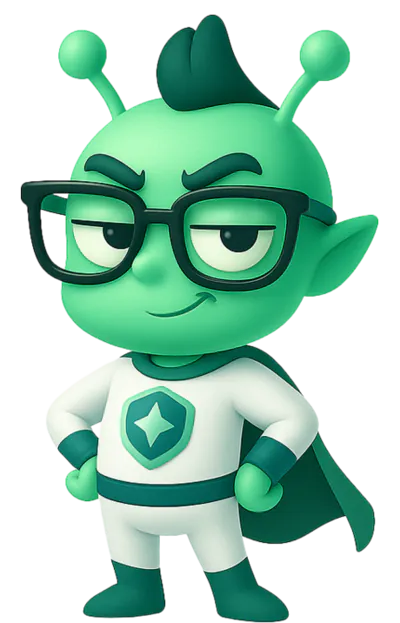
Zylo is the small green alien in the cape who plays alongside you. He is the second player, not the product's mascot: he shows up to react when something lands, and he is off screen the rest of the time.
- Use him for reactions and celebrations, in a bubble or on a finish screen.
- He never explains the interface or introduces a feature.
- He never covers, blocks or delays the content you came for.
Downloads
Take the files
Everything below is cleared for press, partners and anyone building something with us. If you need a variant that is not here, ask before you make one.

Logomark
The shield and spark, on its own.
SVG · vector · 2KB

Horizontal lockup
The mark with the wordmark, for a wide slot.
PNG · 840 x 167 · 49KB
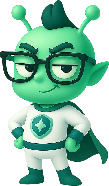
Zylo, standing
Player two, in his default pose.
WebP · 438 x 746 · 49KB
Questions about using the brand: superguide.ai.